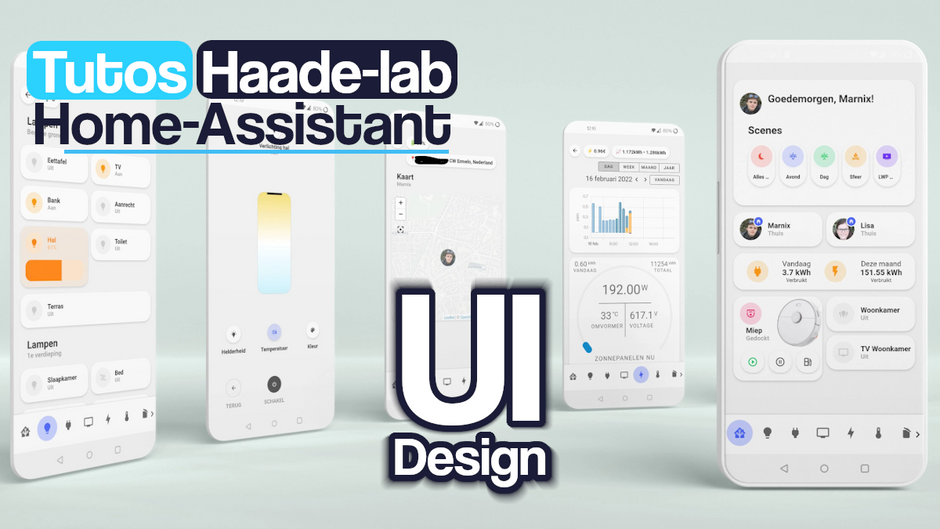
Built a Smartphone environment in HA with UI Minimalist

This page has been visited ... times
Sommary
As everyone knows, Home-Assistant is, in my opinion, one of the best home automation software of the moment. Well, that’s what I think. In this tutorial I will show you how to customize a dashboard with an ultra-designed theme called … UI Lovelace Minimalist.
So why did I choose UI Lovelace Minimalist over Mushroom Card and Theme. Well simply because Ui Minimalist offers more cards and chips than Mushroom.
Mushroom’s goal is not to provide a personalized map for in-depth customization.
Initially I wanted to settle for Mushroom because it was very practical, even if it was not for the installation, but I quickly encountered problems once I wanted to personalize the cards.
Then comes everything else
Prerequisites
- Hacs installed
- Text editor (file editor or VSC editor for example)
Installation UI Lovelace Minimalist
Nothing more simple, just read the official tutorial
First of all, add this line if it is not already in the configuration.yaml file so the themes will be stored in the themes/ subfolder.
# personnalised theme
frontend:
  themes: !include_dir_merge_named themes
HACS
UI Lovelace Minimalist is available in HACS (Home Assistant Community Store).
- Install HACS if you don’t already have it
- Open HACS in Home Assistant
- Go to the “Integrations” section
- Click the button with the “+” icon
- Search for “UI Lovelace Minimalist
Once installed Restart your Home Assistant instance
Then click on the button below to add the UI Lovelace Minimalist integration. If you don’t know yet UI Lovelace Minimalist is not a simple theme but rather a theme/module combo

And configure UI Lovelace Minimalist
I opted for a semi-manual installation additional integrations because I regularly encountered non-recognition error messages
Integration required
- browser_mod by Thomas Loven (attention! activated in two steps see the user manual facility)
Lovelace Resources Required
- button card by RomRider
- card-mod by Thomas Loven
- mini-graph card by Karl Kihlström
- Mini Media Player by Karl Kihlström
- My Cards Pack by AnthonMS** (requires installing an additional HACS directory)
- Light Entity Card by Leonardo Merza
- auto-entities by Thomas Loven
PS: After having encountered problems with the installation of automated add-ons, I advise you to install them manually in Hacs. I constantly had errors of modules not installed from one medium to another.
Themes provided by Minimalist UI
A strong point of this integration are the themes provided with minimalist UI, no less than 4 themes, you will have to select one by default, if you do not do so the Minimalist card display will not be done correctly.
- minimalist-desktop (for use in an office environment)
- minimalist-ios-tapbar (for an Ios environment with only the “views” menu at the footer)
- minimalist-mobile (for mobile environment without no menu)
- minimalist-mobile-tapbar (for mobile environment with only the “views” menu)
configure custom cards
To configure a custom card that you would like to add, nothing could be simpler, click directly on the link below
then click on configure and at the bottom of the page you can add the necessary customs cards.

Where is the file to configure:
The file at ui-lovelace.yaml is the file to modify to configure the view you will find it in: config > ui_lovelace_minimalist > dashboard
config
└── ui_lovelace_minimalist
    ├── custom_cards
    └── dashboard
        └── ui-lovelace.yaml
Tablet display

the display on tablet is done on 2 vertical columns, to do this you must create a card with a vertical-stack type display for each column. By default, if you do not include a vertical stack, the display will be in 3 columns.
Result on smartphone

Example of a vertical column:
cards:
      - type: vertical-stack
        cards:
          - type: horizontal-stack
            cards:
            ...
          - type: horizontal-stack
            cards:
            ...
Example for 2 vertical columns:
cards:
      - type: vertical-stack
        cards:
          - type: horizontal-stack
            cards:
            ...
          - type: horizontal-stack
            cards:
            ...
      - type: vertical-stack
        cards:
          - type: horizontal-stack
            cards:
            ...
          - type: horizontal-stack
            cards:
            ...
1st step configuration of headers

You must:
- the go back button: chips back button
- the temperature button: chips temperature button
- the alarm button: chips alarm button
the code below allows you to create spaces between the content
- type: custom:button-card
                template: edge
Embedded code:
cards:
      - type: vertical-stack
        cards:
          - type: horizontal-stack
            cards:
              - type: "custom:button-card"
                template: chip_back
                variables:
                  ulm_chip_back_path: /profile
              - type: custom:button-card
                template: chip_temperature
                variables:
                  ulm_chip_temperature_inside: sensor.une_sonde_thermometre_interieur
                  ulm_chip_temperature_outside: sensor.une_sonde_thermometre_exterieur_temperature
                  ulm_chip_temperature_weather: weather.meteo_maison
              - type: custom:button-card
                template: edge
              - type: "custom:button-card"
                template: chip_alarm
                entity: alarm_control_panel.ton_alarme
              - type: custom:button-card
                template: edge
          - type: horizontal-stack
            cards:
            ...
      - type: vertical-stack
        cards:
          - type: horizontal-stack
            cards:
            ...
          - type: horizontal-stack
            cards:
            ...
2nd step configuration of titles

repeat the code as many times as you need to integrate a title, go to a horizontal display to put this title under the headers.
- type: horizontal-stack
            cards:
              - type: "custom:button-card"
                template: card_title
                name: Météo
                label: "La météo du Village"
              - type: custom:button-card
                template: edge
              - type: "custom:button-card"
                color_type: blank-card
Embed Code
cards:
      - type: vertical-stack
        cards:
          - type: horizontal-stack
            cards:
              - type: "custom:button-card"
                template: chip_back
                variables:
                  ulm_chip_back_path: /profile
              - type: custom:button-card
                template: chip_temperature
                variables:
                  ulm_chip_temperature_inside: sensor.une_sonde_thermometre_interieur
                  ulm_chip_temperature_outside: sensor.une_sonde_thermometre_exterieur_temperature
                  ulm_chip_temperature_weather: weather.meteo_maison
              - type: custom:button-card
                template: edge
              - type: "custom:button-card"
                template: chip_alarm
                entity: alarm_control_panel.ton_alarme
              - type: custom:button-card
                template: edge

          - type: horizontal-stack
            cards:
              - type: "custom:button-card"
                template: card_title
                name: Météo
                label: "La météo du Village"
              - type: custom:button-card
                template: edge
              - type: "custom:button-card"
                color_type: blank-card

          - type: horizontal-stack
            cards:
            ...
      - type: vertical-stack
        cards:
          - type: horizontal-stack
            cards:
            ...
          - type: horizontal-stack
            cards:
            ...
3rd step a weather bar

There are several, I chose the simplest the weather card
but there are others:
- type: horizontal-stack
            cards:
              - type: "custom:button-card"
                template: card_weather
                entity: weather.ta_meteo
                variables:
                  ulm_card_weather_name: " "
                  ulm_card_weather_primary_info:
                    - wind_speed
                    - precipitation_probability
                  ulm_card_weather_backdrop:
                    fade: true
                  ulm_card_weather_custom:
                    - temp: sensor.temperature
Embed Code:
cards:
      - type: vertical-stack
        cards:
          - type: horizontal-stack
            cards:
              - type: "custom:button-card"
                template: chip_back
                variables:
                  ulm_chip_back_path: /profile
              - type: custom:button-card
                template: chip_temperature
                variables:
                  ulm_chip_temperature_inside: sensor.une_sonde_thermometre_interieur
                  ulm_chip_temperature_outside: sensor.une_sonde_thermometre_exterieur_temperature
                  ulm_chip_temperature_weather: weather.meteo_maison
              - type: custom:button-card
                template: edge
              - type: "custom:button-card"
                template: chip_alarm
                entity: alarm_control_panel.ton_alarme
              - type: custom:button-card
                template: edge

          - type: horizontal-stack
            cards:
              - type: "custom:button-card"
                template: card_title
                name: Météo
                label: "La météo du Village"
              - type: custom:button-card
                template: edge
              - type: "custom:button-card"
                color_type: blank-card

          - type: horizontal-stack
            cards:
              - type: "custom:button-card"
                template: card_weather
                entity: weather.ta_meteo
                variables:
                  ulm_card_weather_name: " "
                  ulm_card_weather_primary_info:
                    - wind_speed
                    - precipitation_probability
                  ulm_card_weather_backdrop:
                    fade: true
                  ulm_card_weather_custom:
                    - temp: sensor.temperature

      - type: vertical-stack
        cards:
          - type: horizontal-stack
            cards:
            ...
          - type: horizontal-stack
            cards:
            ...
4th step presence

One of the reasons that pushed me to choose between ui minimalist and mushroom is indeed the presence card, thanks to a minimalist custom card it is possible to easily integrate tracking, battery charging and more into a card. other options, something that Mushroom cannot do, at least without having to code the card itself.
you will need the Person_info custom card
- type: horizontal-stack
            cards:
              - type: custom:button-card
                template: edge

              - type: "custom:button-card"
                template: card_person_info
                variables:
                  ulm_card_person_entity: person.john_doe
                  ulm_card_person_use_entity_picture: true
                  ulm_card_person_zone1: zone.home
                  ulm_card_person_zone2: zone.travail
                  ulm_multiline: true
                  ulm_card_person_battery_entity: sensor.john_doe_niveau_batterie
                  ulm_card_person_battery_state_entity: sensor.john_doe_etat_batterie
Embed code:
cards:
      - type: vertical-stack
        cards:
          - type: horizontal-stack
            cards:
              - type: "custom:button-card"
                template: chip_back
                variables:
                  ulm_chip_back_path: /profile
              - type: custom:button-card
                template: chip_temperature
                variables:
                  ulm_chip_temperature_inside: sensor.une_sonde_thermometre_interieur
                  ulm_chip_temperature_outside: sensor.une_sonde_thermometre_exterieur_temperature
                  ulm_chip_temperature_weather: weather.meteo_maison
              - type: custom:button-card
                template: edge
              - type: "custom:button-card"
                template: chip_alarm
                entity: alarm_control_panel.ton_alarme
              - type: custom:button-card
                template: edge

          - type: horizontal-stack
            cards:
              - type: "custom:button-card"
                template: card_title
                name: Météo
                label: "La météo du Village"
              - type: custom:button-card
                template: edge
              - type: "custom:button-card"
                color_type: blank-card

          - type: horizontal-stack
            cards:
              - type: "custom:button-card"
                template: card_weather
                entity: weather.ta_meteo
                variables:
                  ulm_card_weather_name: " "
                  ulm_card_weather_primary_info:
                    - wind_speed
                    - precipitation_probability
                  ulm_card_weather_backdrop:
                    fade: true
                  ulm_card_weather_custom:
                    - temp: sensor.temperature

          - type: horizontal-stack
            cards:
              - type: custom:button-card
                template: edge

              - type: "custom:button-card"
                template: card_person_info
                variables:
                  ulm_card_person_entity: person.john_doe
                  ulm_card_person_use_entity_picture: true
                  ulm_card_person_zone1: zone.home
                  ulm_card_person_zone2: zone.travail
                  ulm_multiline: true
                  ulm_card_person_battery_entity: sensor.john_doe_niveau_batterie
                  ulm_card_person_battery_state_entity: sensor.john_doe_etat_batterie

      - type: vertical-stack
        cards:
          - type: horizontal-stack
            cards:
            ...
          - type: horizontal-stack
            cards:
            ...
5th step creation of opening orders

you will need the card cover
- type: horizontal-stack
            cards:
              - type: "custom:button-card"
                template: card_cover
                entity: cover.volets
                variables:
                  ulm_card_cover_enable_controls: true

              - type: "custom:button-card"
                template: card_cover
                entity: cover.garage
                variables:
                  ulm_card_cover_enable_controls: true
                  ulm_card_tap_action: "none"
                  ulm_icon_double_tap_action: "toggle"
                  ulm_name_tap_action: "more-info"
Embed code:
cards:
      - type: vertical-stack
        cards:
          - type: horizontal-stack
            cards:
              - type: "custom:button-card"
                template: chip_back
                variables:
                  ulm_chip_back_path: /profile
              - type: custom:button-card
                template: chip_temperature
                variables:
                  ulm_chip_temperature_inside: sensor.une_sonde_thermometre_interieur
                  ulm_chip_temperature_outside: sensor.une_sonde_thermometre_exterieur_temperature
                  ulm_chip_temperature_weather: weather.meteo_maison
              - type: custom:button-card
                template: edge
              - type: "custom:button-card"
                template: chip_alarm
                entity: alarm_control_panel.ton_alarme
              - type: custom:button-card
                template: edge

          - type: horizontal-stack
            cards:
              - type: "custom:button-card"
                template: card_title
                name: Météo
                label: "La météo du Village"
              - type: custom:button-card
                template: edge
              - type: "custom:button-card"
                color_type: blank-card

          - type: horizontal-stack
            cards:
              - type: "custom:button-card"
                template: card_weather
                entity: weather.ta_meteo
                variables:
                  ulm_card_weather_name: " "
                  ulm_card_weather_primary_info:
                    - wind_speed
                    - precipitation_probability
                  ulm_card_weather_backdrop:
                    fade: true
                  ulm_card_weather_custom:
                    - temp: sensor.temperature

          - type: horizontal-stack
            cards:
              - type: custom:button-card
                template: edge

              - type: "custom:button-card"
                template: card_person_info
                variables:
                  ulm_card_person_entity: person.john_doe
                  ulm_card_person_use_entity_picture: true
                  ulm_card_person_zone1: zone.home
                  ulm_card_person_zone2: zone.travail
                  ulm_multiline: true
                  ulm_card_person_battery_entity: sensor.john_doe_niveau_batterie
                  ulm_card_person_battery_state_entity: sensor.john_doe_etat_batterie

          - type: horizontal-stack
            cards:
              - type: "custom:button-card"
                template: card_cover
                entity: cover.volets
                variables:
                  ulm_card_cover_enable_controls: true

              - type: "custom:button-card"
                template: card_cover
                entity: cover.garage
                variables:
                  ulm_card_cover_enable_controls: true
                  ulm_card_tap_action: "none"
                  ulm_icon_double_tap_action: "toggle"
                  ulm_name_tap_action: "more-info"

      - type: vertical-stack
        cards:
          - type: horizontal-stack
            cards:
            ...
          - type: horizontal-stack
            cards:
            ...
Let’s move on to the Second column
to create the second column you have to start again on a new vertical-stack
- type: vertical-stack
        cards:
          - type: horizontal-stack
            cards:
Dans la seconde colonne on aura:
- One carte titre
- 4 x Room Card
- One carte light
1. Setting up the title
- type: vertical-stack # création seconde colonne
        cards:
          - type: horizontal-stack # mise en place du titre
            cards:
              - type: "custom:button-card"
                template: card_title
                name: Lumières
                label: "Contrôle les lumières par pièce"
2. Setting up the Room Card
- type: horizontal-stack # mise en place de la roomcard
            cards:
              - type: "custom:button-card"
                template:
                  - card_room
                  - red_no_state
                name: Cuisine
                entity: light.all_cuisine # création d'un entité regroupant toutes les lumières de la cuisine
                icon: mdi:countertop
                tap_action:
                  action: navigate
                  navigation_path: "/ui-lovelace-minimalist/bathroom"
                variables:
                  label_use_temperature: false
                  label_use_brightness: true
                  entity_1:
                    entity_id: light.all_cuisine
                    templates:
                      - yellow_on
                    tap_action:
                      action: toggle
                  entity_2:
                    entity_id: binary_sensor.toutes_portes_cuisine
                    templates:
                      - blue_on
                    tap_action:
                      action: none
3. Adding a light map
- type: horizontal-stack
cards:
- type: "custom:button-card"
template: card_light_slider_horizontal
entity: light.lumiere_ambiance_salon
variables:
ulm_card_light_enable_slider: true
ulm_card_light_enable_color: true
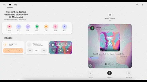
ulm_card_light_force_background_color: trueMinimalist UI dashboard example
Here you will be able to realize that the Minimalist UI theme is relatively powerful to find tips you can follow the thread: Minimalit UI Community


Adaptive View Bonus
Warning
the state-switch module must be installed in version 1.9.3, otherwise the adaptive popup will not work correctly, to find out more you can consult the post which talks about it
lovelace Ui Minimalist Community
Folder architecture
config
└── ui_lovelace_minimalist
    ├── custom_cards
    └── dashboard
        └── ui-lovelace.yaml
        └── adaptive-dash
            └── adaptive-ui.yaml
            └── popup
                └── popup.yaml
            └── views
                └── livingroom.yaml
                └── main.yaml
Info UI Lovelace Minimalist Adaptive
The adaptive view is an extra bonus especially dedicated to tablet displays. You will need to install two additional modules, you just need to consult the official instructions which are very detailed.
adaptive view installation instructions
example adaptive dashboard code by Basbruss
Info
Currently minimalist UI adaptive supports the following device types: lights, mediaplayers, thermostats, sensors
Activation
Activation of this view is done in the module configuration

to start: 3 files to modify
configuration.yaml
add an input_select to the names you choose
# Minimalist UI adaptative dashboard
input_select:
  adaptive_dashboard:
    name: Select popup/view
    options:
      - light 1
      - light 2
      - mediaplayer 1
      - mediaplayer 2
      - climate 1
      - climate 2
      - power 1
      - power 2
      - livingroom
then it will be necessary to adapt the generated codes main.yaml, popup.yaml
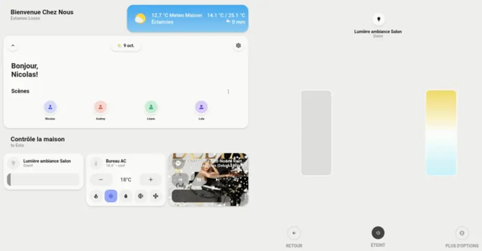
for me the main.yaml gives this result:
---
type: "custom:layout-card"
layout_type: "custom:grid-layout"
layout:
  # Tablet portrait
  grid-template-columns: "1fr 1fr 1fr 1fr 1fr 1fr"
  grid-template-areas: |
    "text text text weather weather weather"
    "welcome welcome welcome welcome welcome welcome"
    "title1 title1 title1 title1 title1 title1"
    "card1 card1 card2 card2 card3 card3"
    "title2 title2 title2 title2 title2 title2"
    "card4 card4 card5 card5 card6 card6"
  mediaquery:
    # Mobile
    "(max-width: 800px)":
      grid-template-columns: "1fr 1fr"
      grid-template-areas: |
        "welcome welcome"
        "person person"
        "title1 title1"
        "card1 card2"
        "card3 card4"
        "title2 title2"
        "card5 card6"
        "card7 card8"
view_layout:
  grid-area: "main"
cards:
  - view_layout:
      grid-area: "text"
    type: "custom:button-card"
    template: "card_title"
    name: "Bienvenue Chez Nous"
    label: "Estamos Locos"

  - view_layout:
      grid-area: "weather"
    type: "custom:button-card"
    template: card_weather
    entity: weather.maison
    variables:
      ulm_card_weather_name: "Meteo Maison"
      ulm_card_weather_backdrop:
        fade: true
      ulm_card_weather_custom:
        - temp: sensor.netatmo_exterieur_temperature
    label: "grid-area: weather"

  - view_layout:
      grid-area: "welcome"
    type: "custom:button-card"
    template: "card_welcome_scenes"
    #triggers_update: input_boolean.<Your_boolean>
    #entity: input_boolean.<Your_boolean>
    variables:
      #  ulm_card_welcome_scenes_collapse: input_boolean.collapse_card
      ulm_weather: "weather.maison"
      entity_1:
        entity_id: "person.rodriguez_nicolas"
        name: "Nicolas" #OPTIONAL
        color: "blue"
      entity_2:
        entity_id: "person.audrey"
        name: "Audrey" #OPTIONAL
        color: "red"
      entity_3:
        entity_id: "person.leane"
        name: "Léane" #OPTIONAL
        color: "green"
      entity_4:
        entity_id: "person.lola"
        name: "Lola" #OPTIONAL
        color: "purple"

  - view_layout:
      grid-area: "title1"
    type: "custom:button-card"
    template: "card_title"
    name: "Contrôle la maison"
    label: "tu Esta"

  - view_layout:
      grid-area: "card1"
    type: "custom:button-card"
    template: card_light
    label: "grid-area: card1"
    entity: light.lumiere_ambiance_salon
    variables:
      ulm_icon_tap_action: "adaptive"
      ulm_card_light_enable_slider: true
      ulm_card_light_enable_color: true
      ulm_card_light_enable_popup: true
      ulm_input_select_option: light 1
      ulm_input_select: input_select.adaptive_dashboard

  - view_layout:
      grid-area: "card2"
    type: "custom:button-card"
    template: card_thermostat
    label: "grid-area: card2"
    entity: climate.bureau_ac
    variables:
      ulm_icon_tap_action: "adaptive"
      ulm_card_thermostat_enable_collapse: true
      ulm_card_thermostat_enable_controls: true
      ulm_card_thermostat_enable_hvac_modes: true
      ulm_card_thermostat_enable_popup: true
      ulm_input_select_option: climate 1
      ulm_input_select: input_select.adaptive_dashboard

  - view_layout:
      grid-area: "card3"
    type: "custom:button-card"
    template: card_media_player
    entity: media_player.spotify_nicoxygen
    label: "grid-area: card3"
    variables:
      ulm_icon_tap_action: "adaptive"
      ulm_card_media_player_name: Spotify
      ulm_card_media_player_enable_popup: true
      ulm_card_media_player_enable_controls: true
      ulm_card_media_player_enable_art: true
      ulm_card_media_player_enable_volume_slider: true
      ulm_input_select_option: mediaplayer 1
      ulm_input_select: input_select.adaptive_dashboard
and the popup.yaml
---
type: "custom:state-switch"
view_layout:
  grid-area: "popup"
  show:
    # only show when screen-width is larger than 1100px
    mediaquery: "(min-width: 810px)"
# add your input_select
entity: input_select.adaptive_dashboard
default: "default"
transition: "slide-down"
transition_time: 500
# options set in the input_select
states:
  #Devices
  ##  Lights
  light 1: &popup_light
    type: "custom:button-card"
    template: "popup_light_brightness"
    entity: light.lumiere_ambiance_salon

  light 2:
    <<: *popup_light
    entity: light.luminaire_plante_salix

  ###  Mediaplayers
  mediaplayer 1:
    type: "custom:button-card"
    template: "popup_media_player_infos"
    entity: media_player.spotify_nicoxygen

  ### Thermostats
  climate 1:
    type: "custom:button-card"
    template: "popup_thermostat_temperature"
    entity: climate.bureau_ac
to refresh the frontend you will need to force the page adaptive_ui.yaml by making a modification and saving
Result
Conclusion UI Lovelace Minimalist
UI Lovelace Minimalist provides a complete frontend interface that is quite simple to set up. Less simple than Mushroom but much more customizable thanks to the additional maps provided by the community. Once you understand the mechanism, UI Lovelace Minimalist will seem obvious to you.

Articles that might interest you
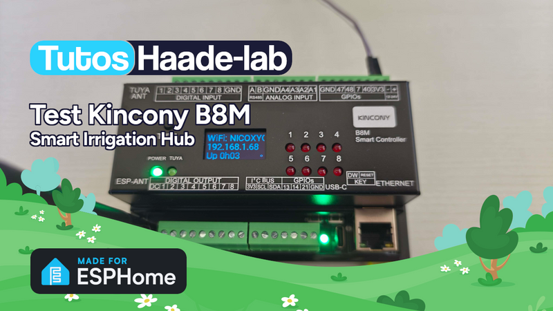
Kincony B8M ESP32 8-channel MOSFET controller test for irrigation
I’ve been looking for a compact and silent multi-channel controller to drive my 24V DC irrigation system for quite some time. After testing Zigbee solutions like the Sonoff SWV or...

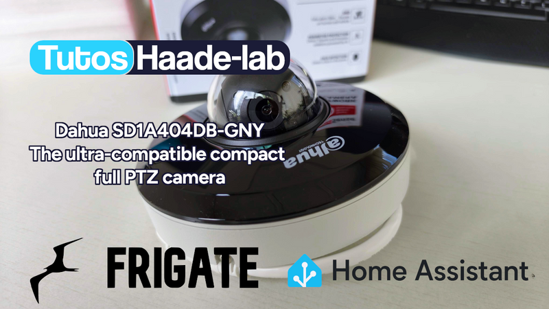
Dahua SD1A404DB-GNY the full option PTZ camera in Frigate
Following my Reolink Trackmix Poe camera test, I mentioned having found my ideal camera with a Dahua model. Well, here we are! Let me introduce the Dahua SD1A404DB-GNY, a compact...
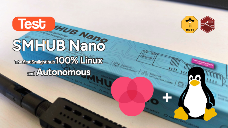
SMLIGHT SMHUB NANO Review: The fully independent Linux smart home hub
After testing the SLZB-MR4U multi-radio dongle, I’m turning back to the SMLIGHT brand for a radically different yet equally exciting product: the SMHUB NANO MG24.
Comments